Nichiban
scroll down
Nichiban
Category
Strategy / Identity / Print
Overview
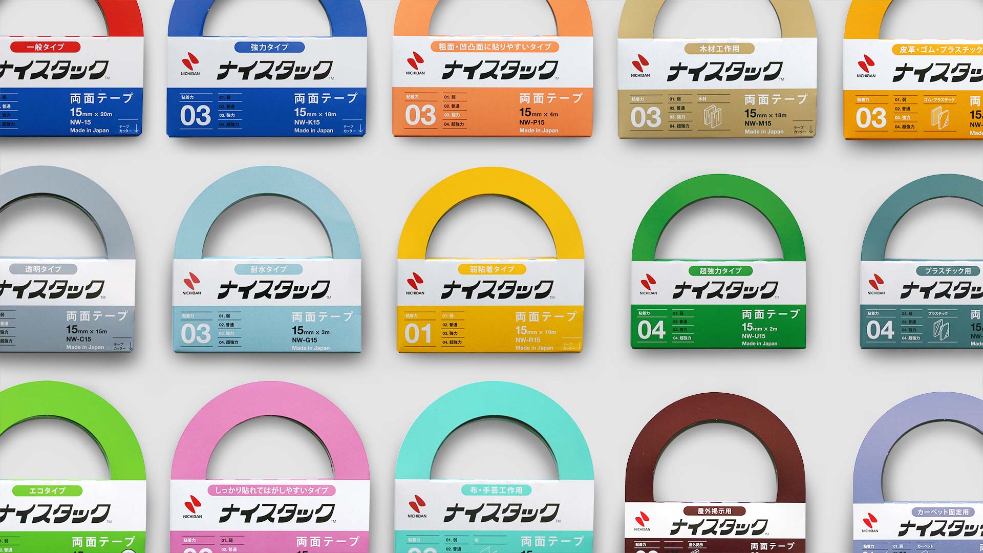
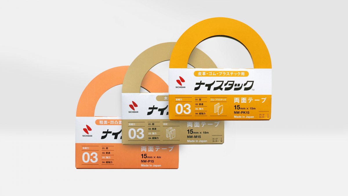
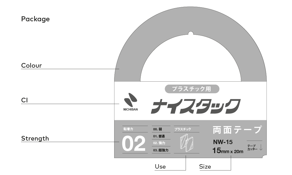
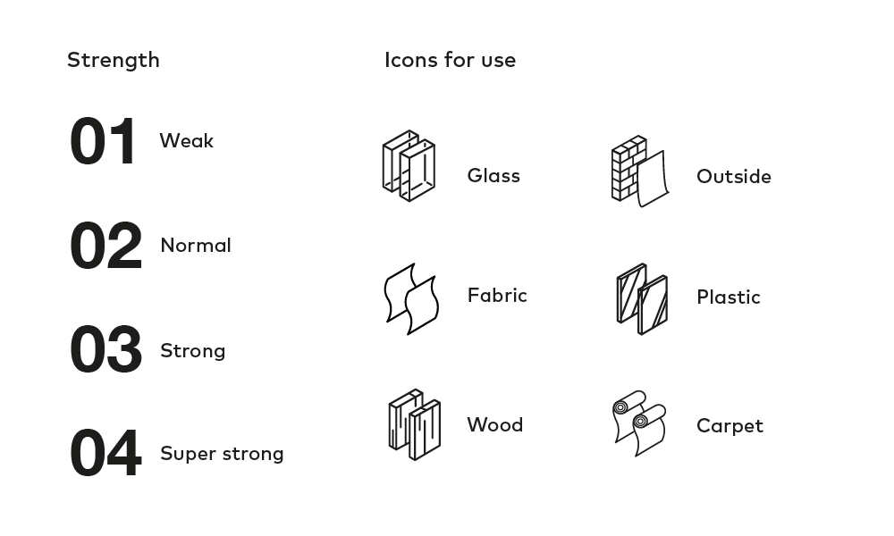
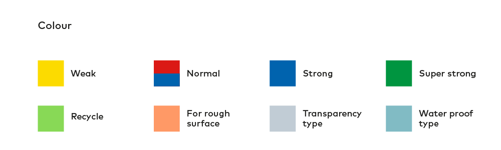
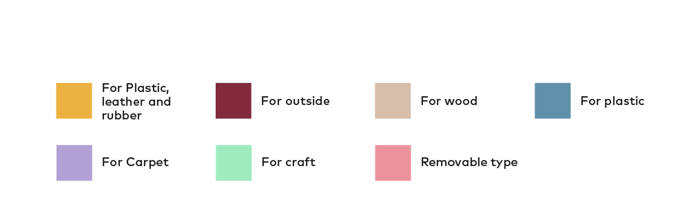
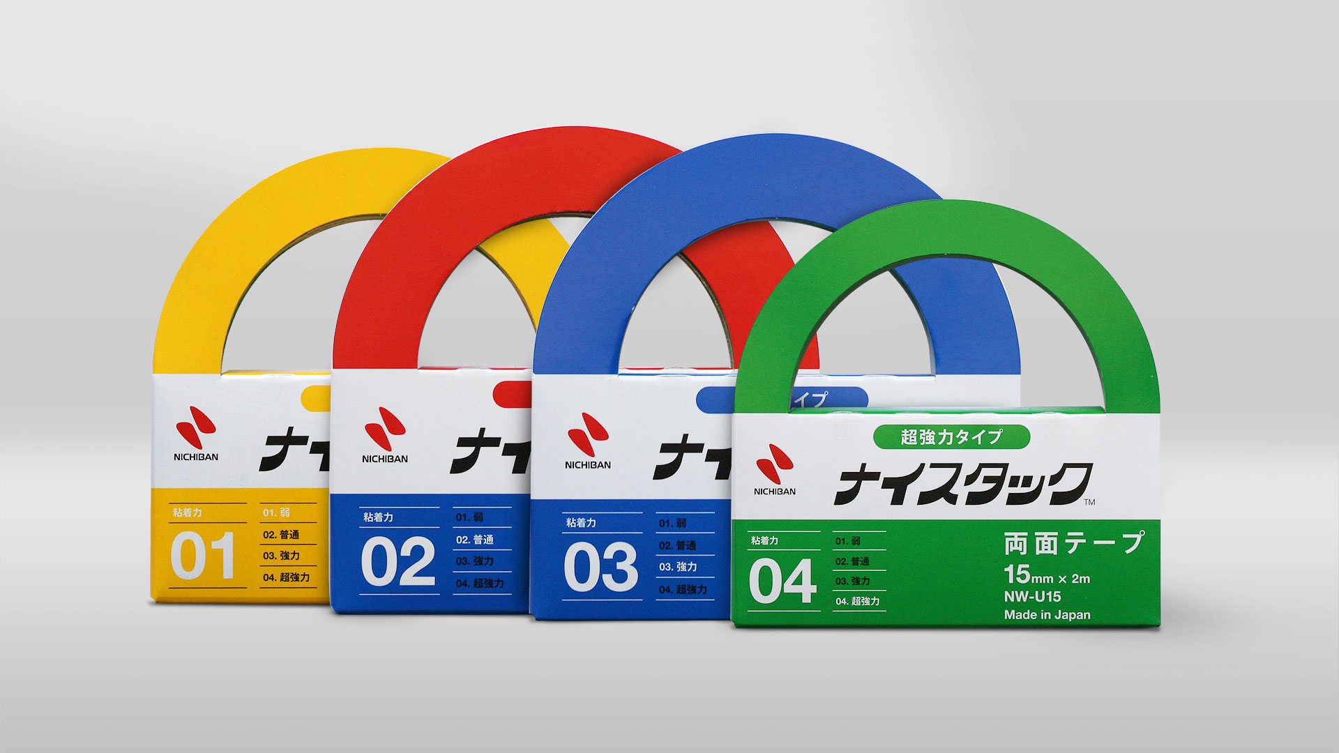
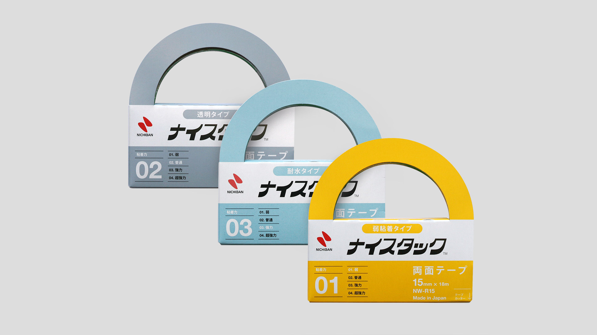
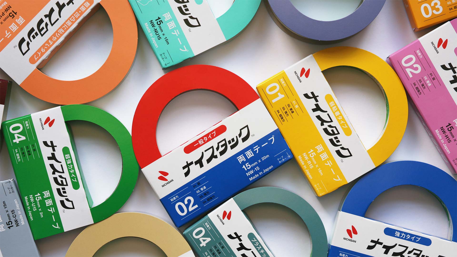
A branding project with Nichiban, Japan’s largest adhesive tape manufacturer. We defined the brand DNA for their stationery division and renewed the packaging design of their core household name product, Nice-tack. The use of bold colour codes and sophisticated typography helped to visualise the wide range of products on offer made with advanced technology. The result was greater clarity and sales as a high quality and yet accessible product for everyday life.
Credits
Creative Direction: Anyhow
Art Direction: Anyhow
Design: Anyhow
Next Project
V&A Museum
of Childhood /
Design Workshop