Echizen
Washi
scroll down
Echizen
Washi
Category
Strategy / Identity / Print / Digital
Overview
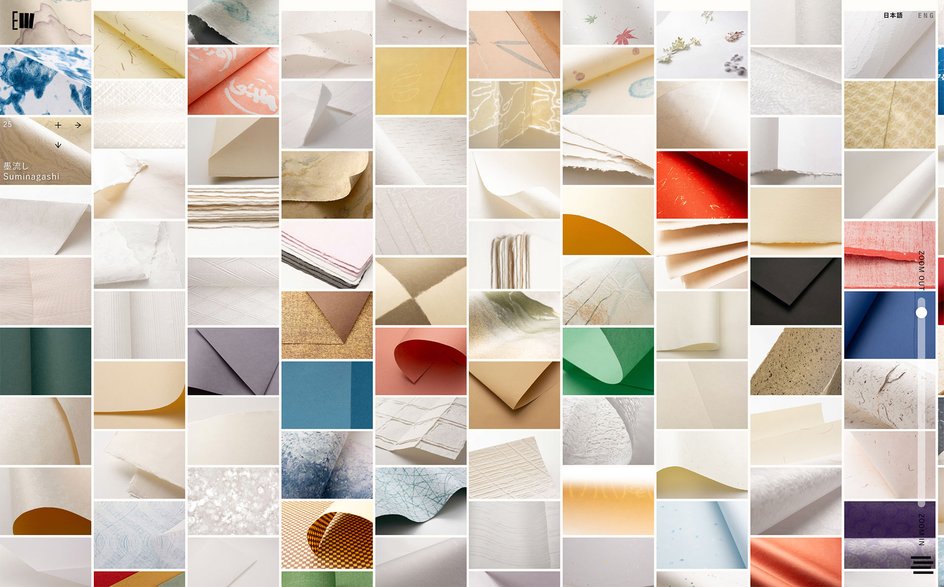
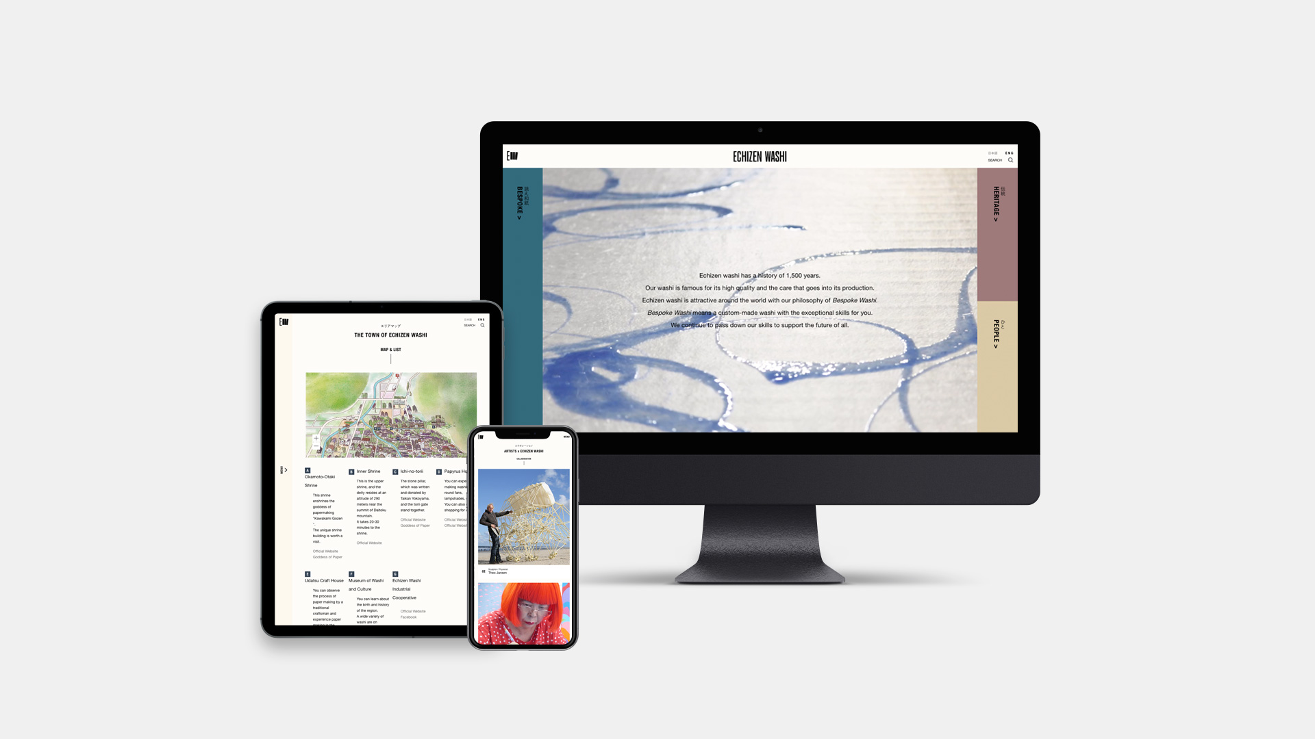
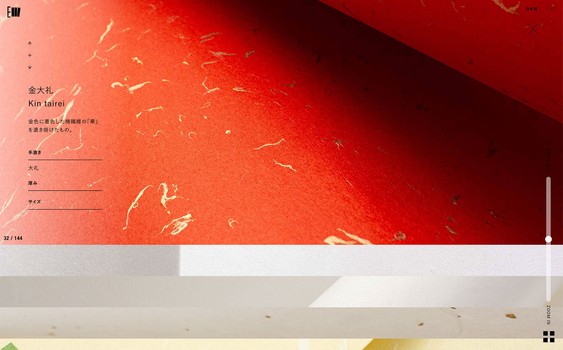
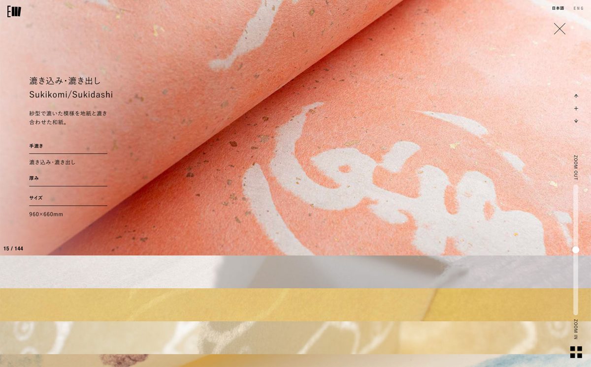
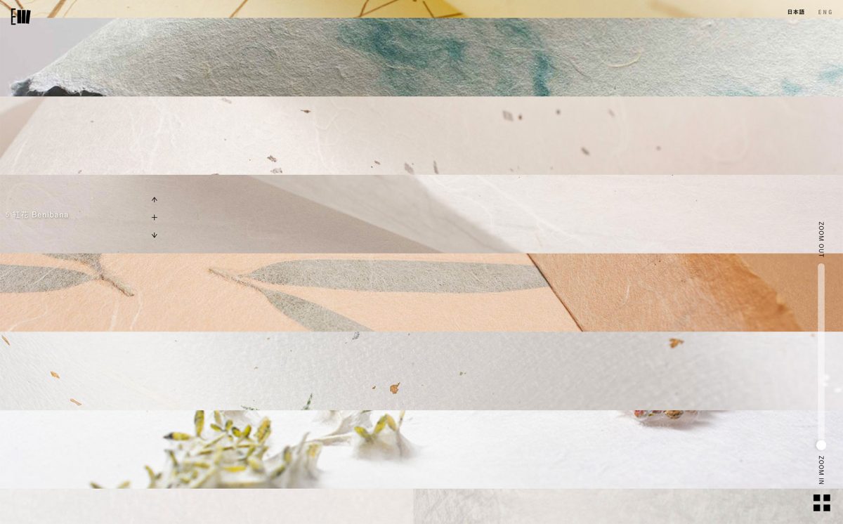
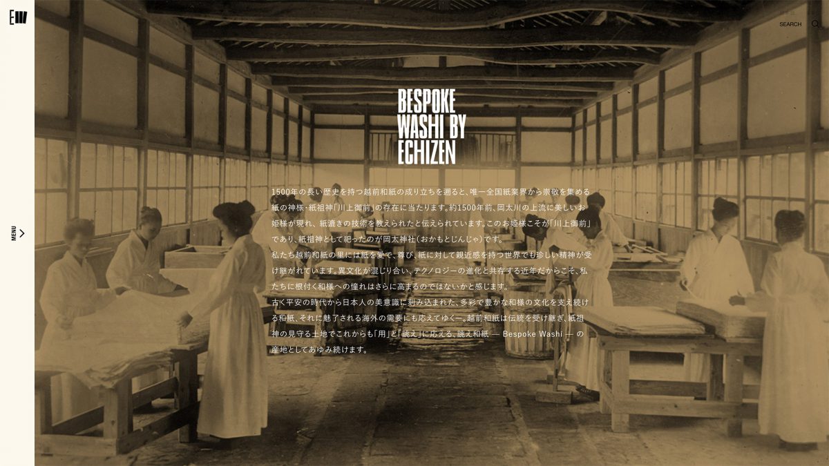
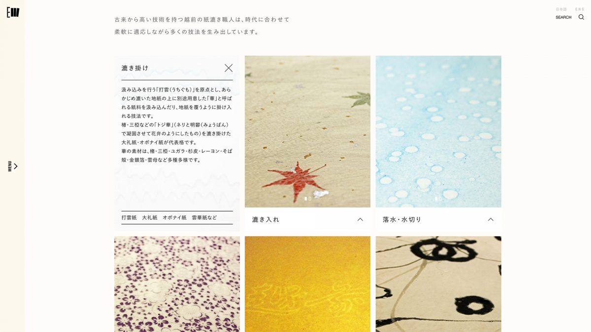
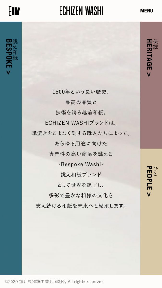
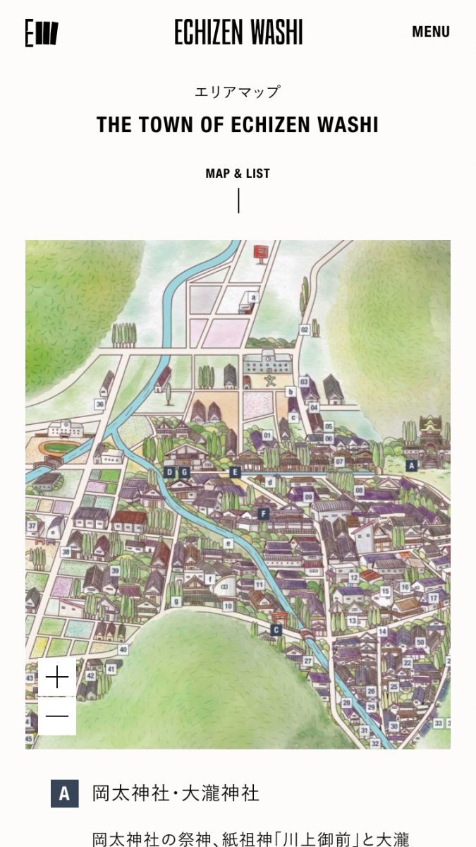
A provenance branding project of Echizen Washi, a traditional Japanese paper, made in five districts in Echizen city in Fukui prefecture. The objective was to transmit its value to the world and pass it onto the next generation as an exceptional brand with 1500 years of history. In this project, we clarified the brand DNA, established the brand strategy, and created the brand story and identity.
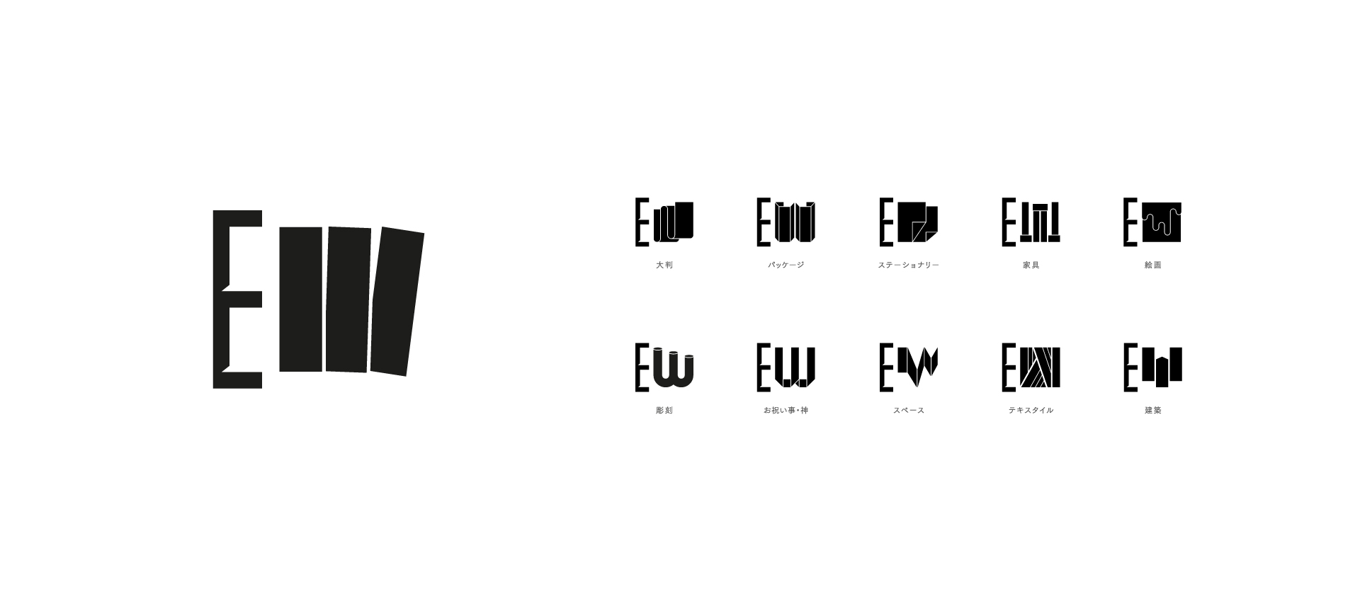
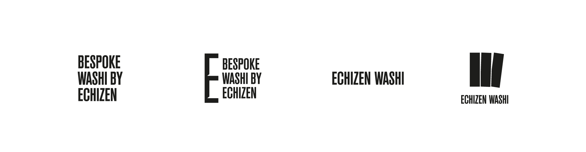
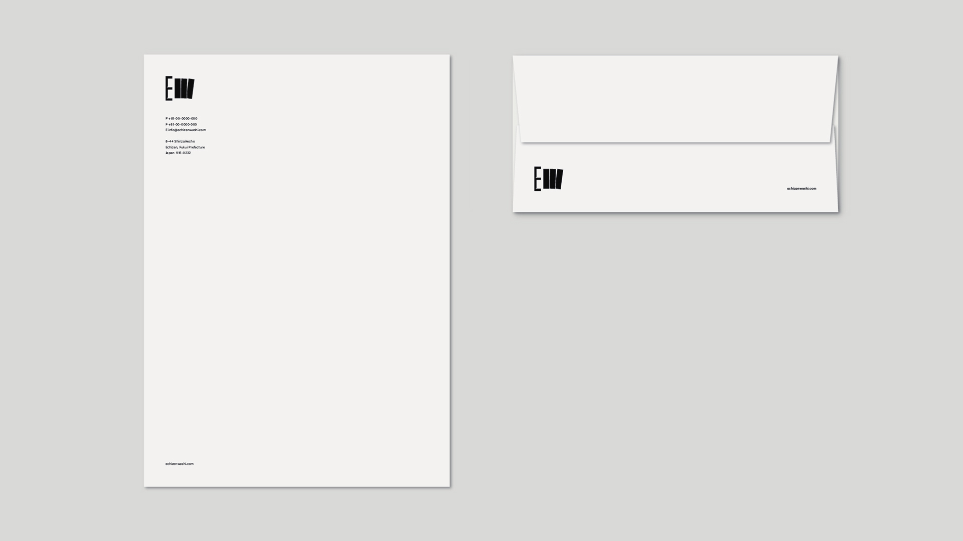
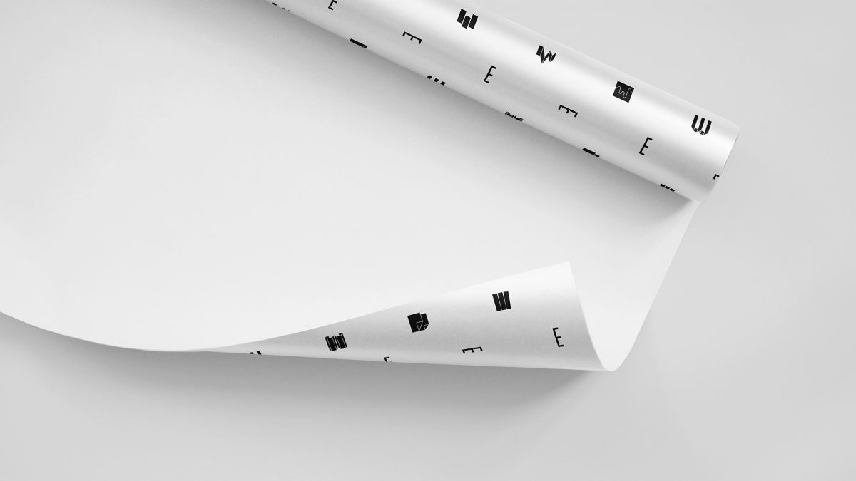
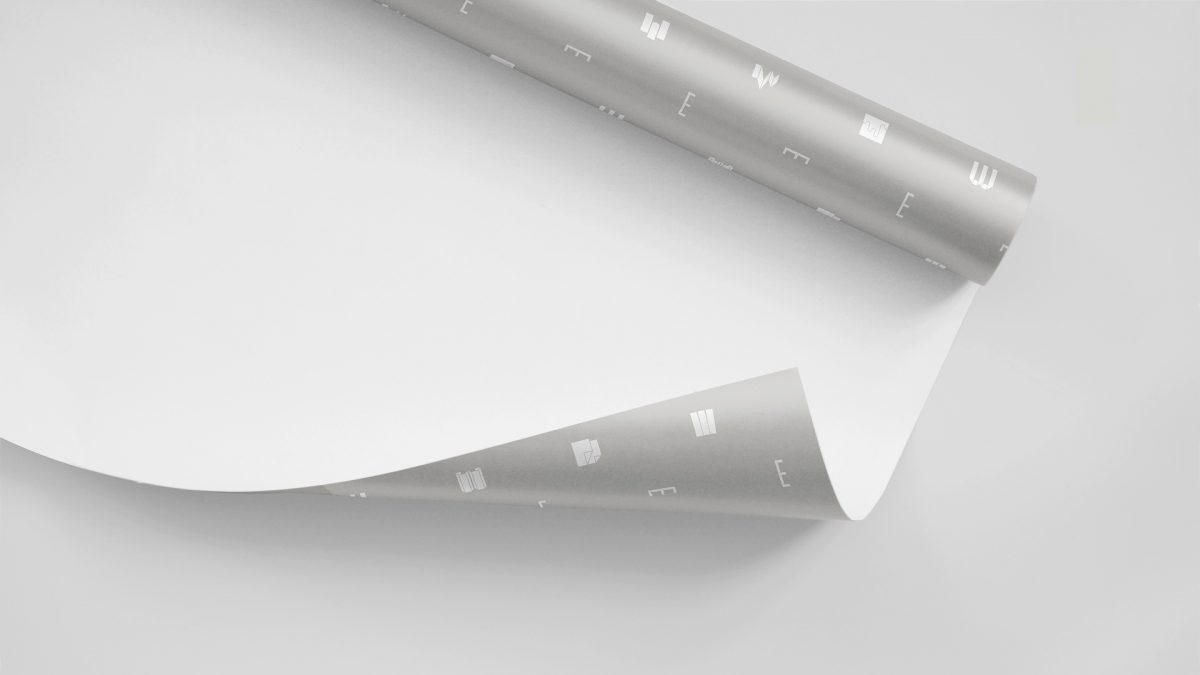
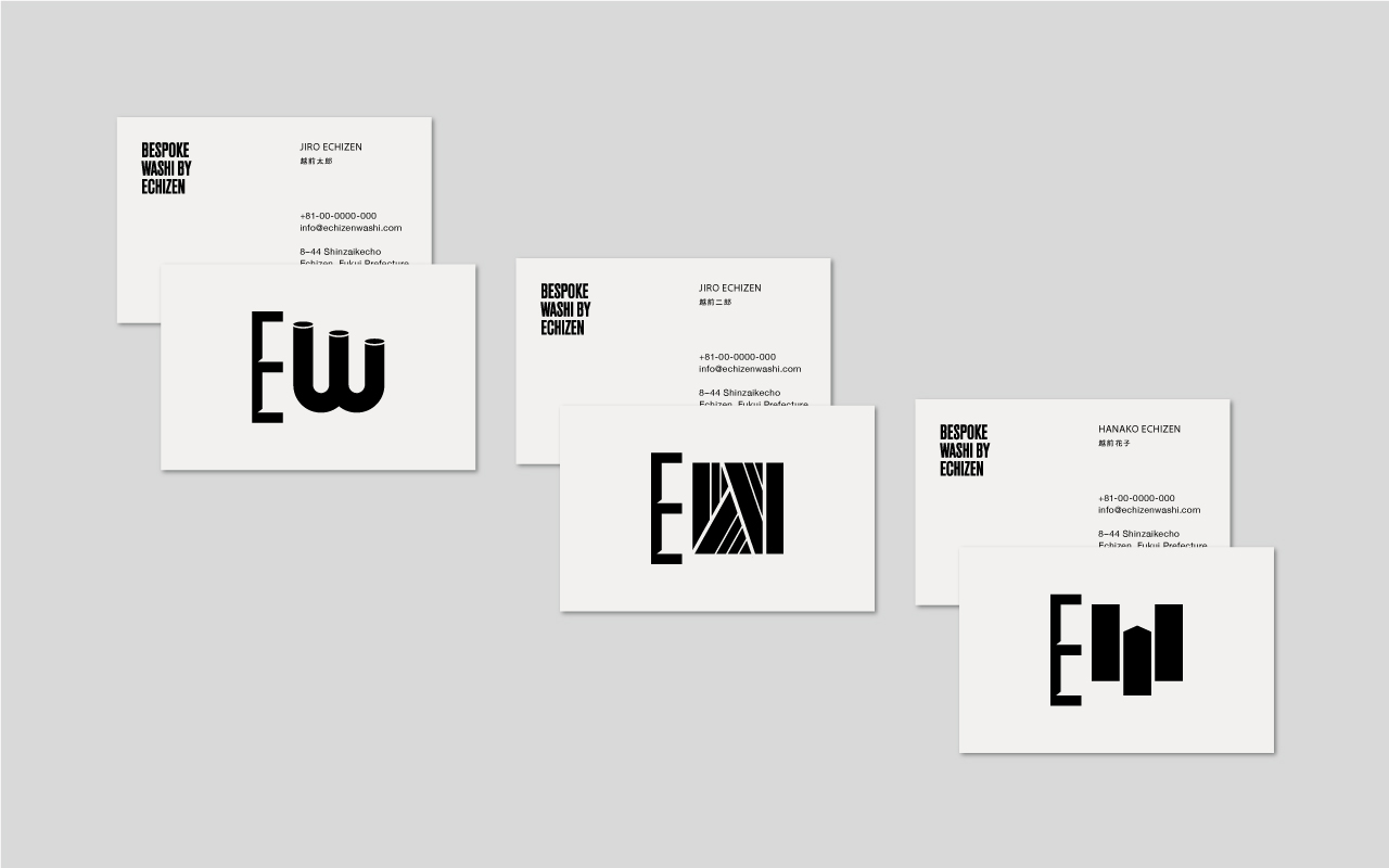
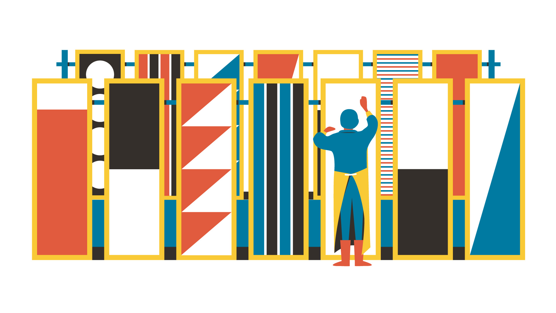
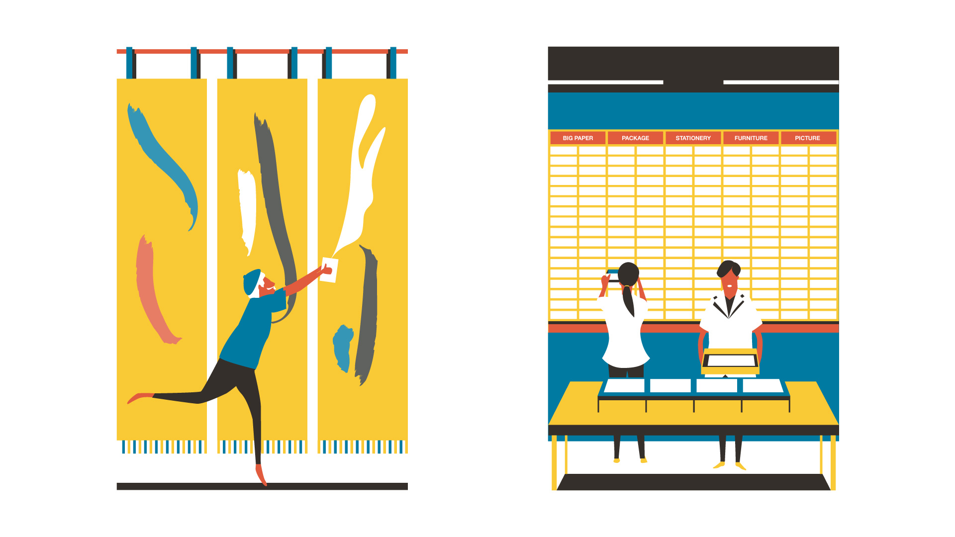
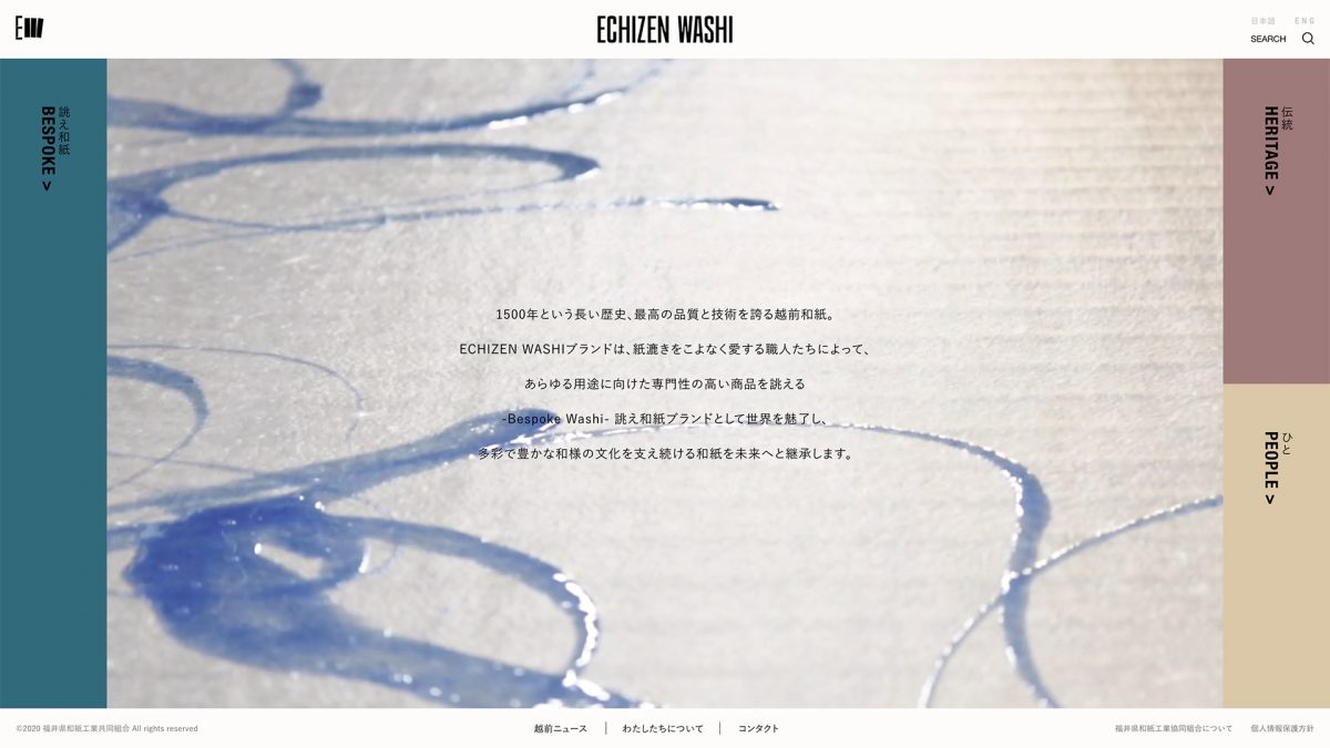
The new logo “EW” for Echizen Washi represents the hand-making nature of the craft; the typography for E is drawn from a traditional tool while the inspiration for W is found in a final scene of the production. The dynamic visual is designed to leave a sense of hands of skilled craftspeople. Also, we have produced a variety of typography designs for W to showcase the strength of the brand; it can create bespoke papers to cater to all kinds of clients' needs.
Credits
Creative Direction: Anyhow
Art Direction: Anyhow
Design & Illustration: Anyhow


Next Project
BAO BAO
ISSEY MIYAKE
MISTY MOON